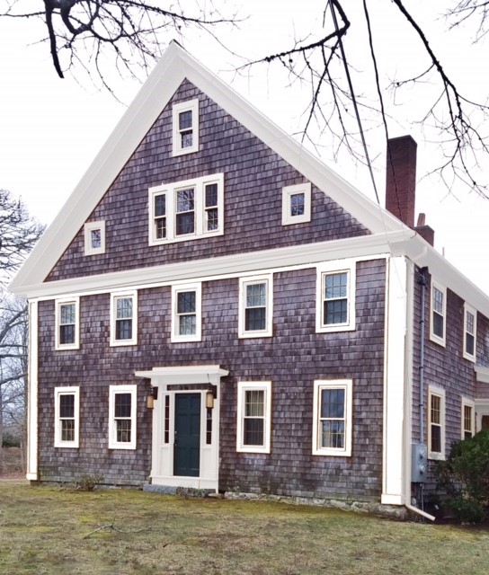
White Trim Paint for Everybody
How to Choose the Right White Trim Paint
White trim paint is white trim, right? The more it "pops" the better, yes? Well…no and no! It is easy to create conflict and drama but harder to create a sophisticated scheme of interdependent colors and tones. It is easy to create something which "pops" but it is hard to live with something sharp over a long period of time. Our senses grow weary of the harshness.
A well known national brand of paint has in its palette 140 white paint options. While that may seem excessive, there is good reason why there are so many choices. Your trim is an accessory to your body color and has the power to define it much in the way that a pair of shoes can define an outfit. Your paint trim is not an afterthought but part of the integral whole of your color scheme.
A fun thing to do is to go to the paint store and gather up at least a dozen different white paint chips at random. Cut the paint squares apart and trim off the white borders…lay them all out next to each other. This is not to confuse you but rather to help you understand the range of colors that white can exhibit. Once you compare, it will become easier for you to start to be able to "read"
undertones. This is the first step towards specifying the appropriate color for your situation.

Unless the white you are choosing is simple titanium white, there will be complex but subtle undertones to the specific white you have targeted. Choosing your white depends upon your goal for the appearance of the house as well as the body color you have chosen. What do I mean by the "goal"?…well that is the look and feel (or mood) you wish to create at first glance. Is this a home in the suburbs, is it rural, or is it in the city? Each of these settings will have differing lighting situations and also will have certain guideposts which you can aim for.`
A home in a rural setting may be heavily shaded and will undoubtedly have the requirements for a softer appeal in the midst of so much foliage. Here, a moderated approach would be in order so that the house appears to be part of the setting rather than a man-made object at odds with its environment. Does this mean that your house should be green? No, but it does mean that a more muted approach to color and trim which is not bright white would be the most appealing. The darker the body color, the more latitude you have in choosing a deeper off-white which will still appear to be white because of its extreme relationship with the deeper body color.
A city house is an exercise in dynamic relationships. In the city, there is lots of concrete and stone. Reflected color from this heavily gray environment and its hard edges calls for a sharper palette on your house. Colors and their relationships need to be bolder and more dynamic. It just looks right here. Bright red doors, sharp white trim paint…these things are perfect for in-town but just awful in a more natural setting.
Lastly the suburban setting is a bit closer to the rural requirements as the houses are likely to be surrounded by plantings. Here, community standards come into play and you will want to follow suit if your home is in a neighborhood. In suburban Boston where I work, many homes are some sort of beige. Beige is a very complicated color to work with. They are not all created equally and all have decided undertones. These undertones reveal themselves when broadcast over a large area and/or paired with white trim paint which can either make the beige sing or make it look ashy and dull.
Beware the Gingerbread House Syndrome

The more contrast between trim and body, the more that trim will become a line of motion on your facade.
Contrast = line; line = motion…and motion is dynamic
A bright white that is a little too contrast-y may serve not to compliment the color but rather to outline the house. Your eye wants to see contrast first over color and it will be directed to the contrast. Your eye will move along the line until it makes a complete path around the house. In this instance, a white which "pops" is not a good thing.
General Guidelines
After your paint chip comparison exercise, you will see that there are undertones in every color of the rainbow; green, blue, yellow, rosy, etc. Choosing the right trim is easy if you follow this general rule:
If your body color tends toward blue undertone, then choose a cooler white trim such as Benjamin Moore’s Bone White or Decorator's White. If your body color is more yellow then
Linen White is a classic choice. Remember though that there are 137 other whites and these are simple suggestions. You will want to temper the brightness of your white appropriate to your body color.
OK, still confused? Color is complicated. "Wait" you say, "my house is red not yellow or blue". How do you understand undertone?…here are some examples, for simplicity I will use Benjamin Moore colors;
A blue with yellow undertones would be.HC-148, Jamestown Blue. A blue with blue undertones would be HC-159, Philipsburg Blue.
A red with blue undertones would be 2083-20, Cranberry Cocktail. A red with yellow undertones would be 2080-20, Confederate Red.
A green with yellow undertones would be HC-118, Sherwood Green. A green with blue undertones would be HC-131, Lehigh Green.
A beige with yellow undertones would be HC-39, Putnam Ivory.
A beige with blue undertones would be HC-80, Bleeker Beige.
Again, go to the paint store and get chip samples, as with the white trim paints, cut them apart and compare, you will be amazed at how you will readily be able to see the
undertones. Once you get
undertones for white trim paints...you are there!
