CITY PALETTES
What are City Palettes?
A color palette is a collection of colors curated specifically to achieve a certain design goal. City palettes are a targeted niche selection of colors designed to work best in an urban setting.
Urban environments are unique in the way that materials are used amongst buildings and roads. The lighting in a city environment can be minimized due to the presence of tall buildings which block the sunshine. The color of the light is cooler because much of the light is reflected off of concrete, glass, and steel.

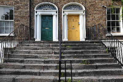
Bold colors do well against the backdrop of neutral masonry or concrete structures
City...the word itself makes us think of excitement. What is it about an urban environment that makes us think that way? A city is a place of many possibilities, of extreme contrasts and high drama. City palettes as applied to buildings must be representative of their environment or they will look out of place. This is true for any building in any location.
I always think of cities as places where men and women dress up to the nines. Apply that same dressy attitude to a city facade and you may get a bold color on the front door dressed with highly polished brass accents. Think again about a chic city woman with bold red lipstick and gold jewelry…you get my drift? That bright red door which looks so smart and so right on a city street often looks like the door to Santa’s workshop if placed in the suburbs The city palette is about that bit of “eye candy” as relief in a sea of concrete and stone grayness…we absolutely crave it!

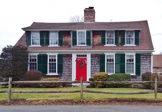
I do a lot of driving in my consultation work and I'm always looking at homes wherever I go. I recently came upon this well cared for home. It's a perfect example of a good idea gone astray.
The front door is powerful, we do want the main portal to be a bulls-eye on the front of the building but here, it's overstated.
This is a country home wearing a city hat. A muted red would have been more in harmony with the natural setting.
Unfortunately also, this particular red in combination with the green shutters breaks one of the primary rules of avoiding connotations of familiarity. Red/green makes Christmas, orange/black is Halloween, and yellow/purple is Easter. These are intensely emotional symbolic color pairs and are best to be avoided if you are looking to market your home for the broadest possible appeal.
It’s not just about color either. The sheen used in paint and other
material finishes goes a long way to setting the tone. Anything glossy and highly polished
is dressy, flat finishes are casual. You will want to choose a high gloss for the
front door and possibly any other accents on the facade. Flat finishes
have their place only as foils for the glossy ones. Remember opposites
are dynamic and that is what the city is all about.
You also build dimensional interest when using varied sheens next to each other. The glossy will come forward in space, and the flat will recede. In effect you would be turbocharging the building in a three dimensional way which color alone cannot accomplish.
Back to Exterior House Paint Colors Home Page